Your Cart is Empty
We ship hundreds of parcels worldwide every week,
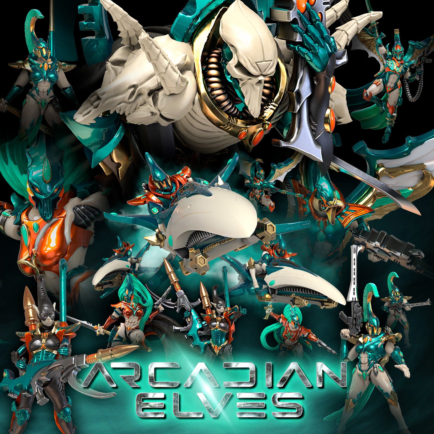
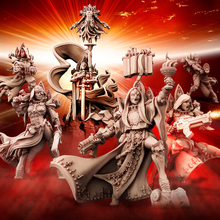
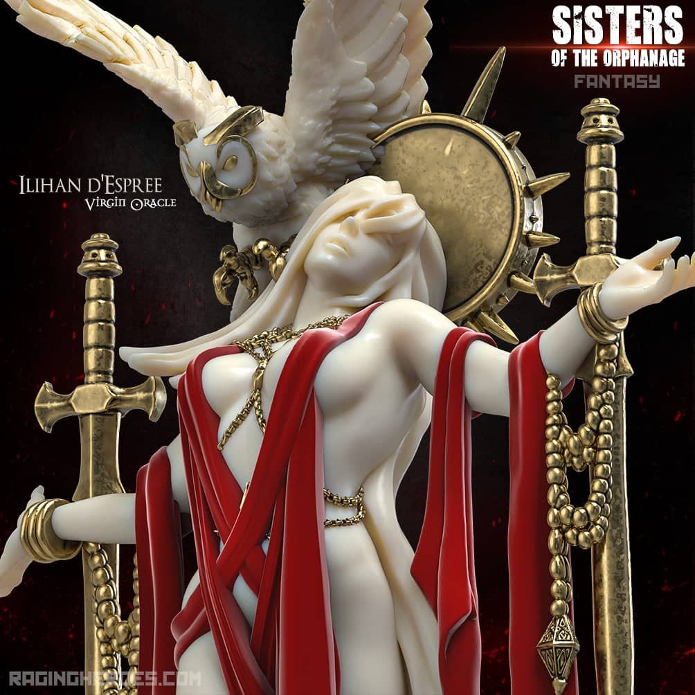
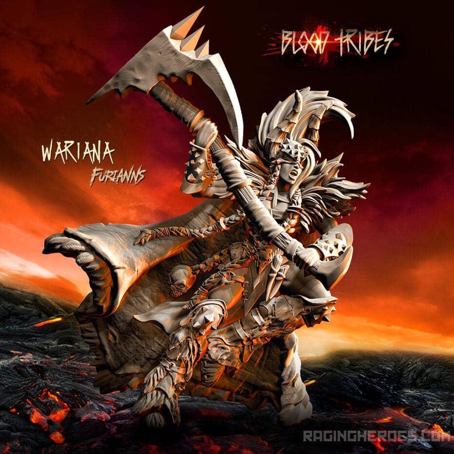
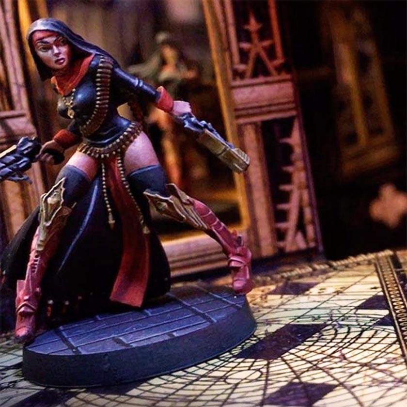
make among the best miniatures on the market,
deliver our legendary great customer service,
and we've been doing it for over 10 years...
And you get a cool Rewards program
and tracked FREE shipping for all orders over 59 Euro.
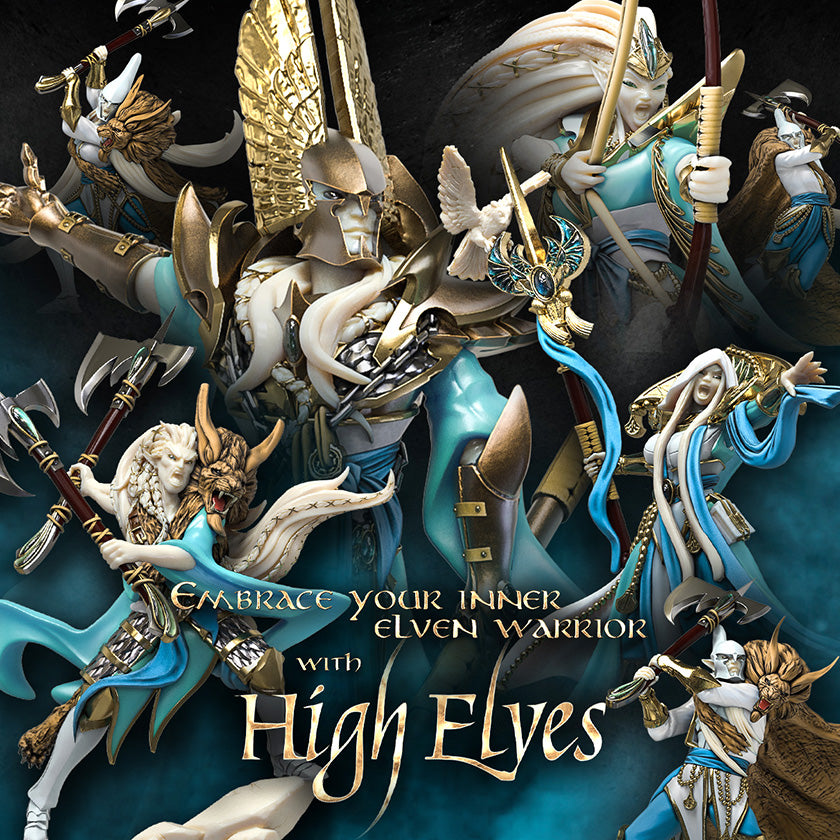
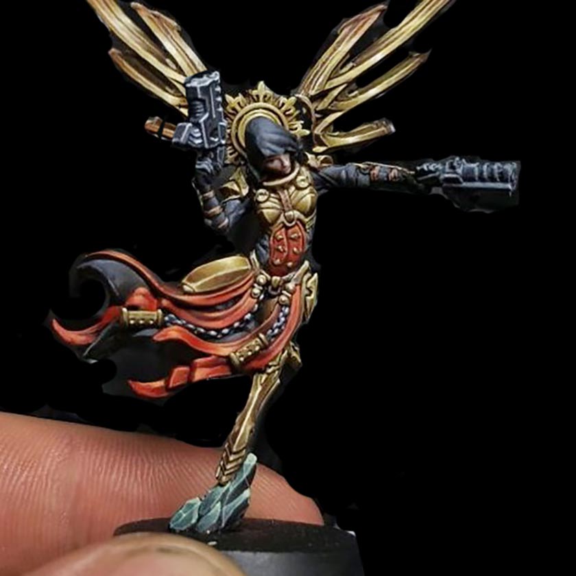
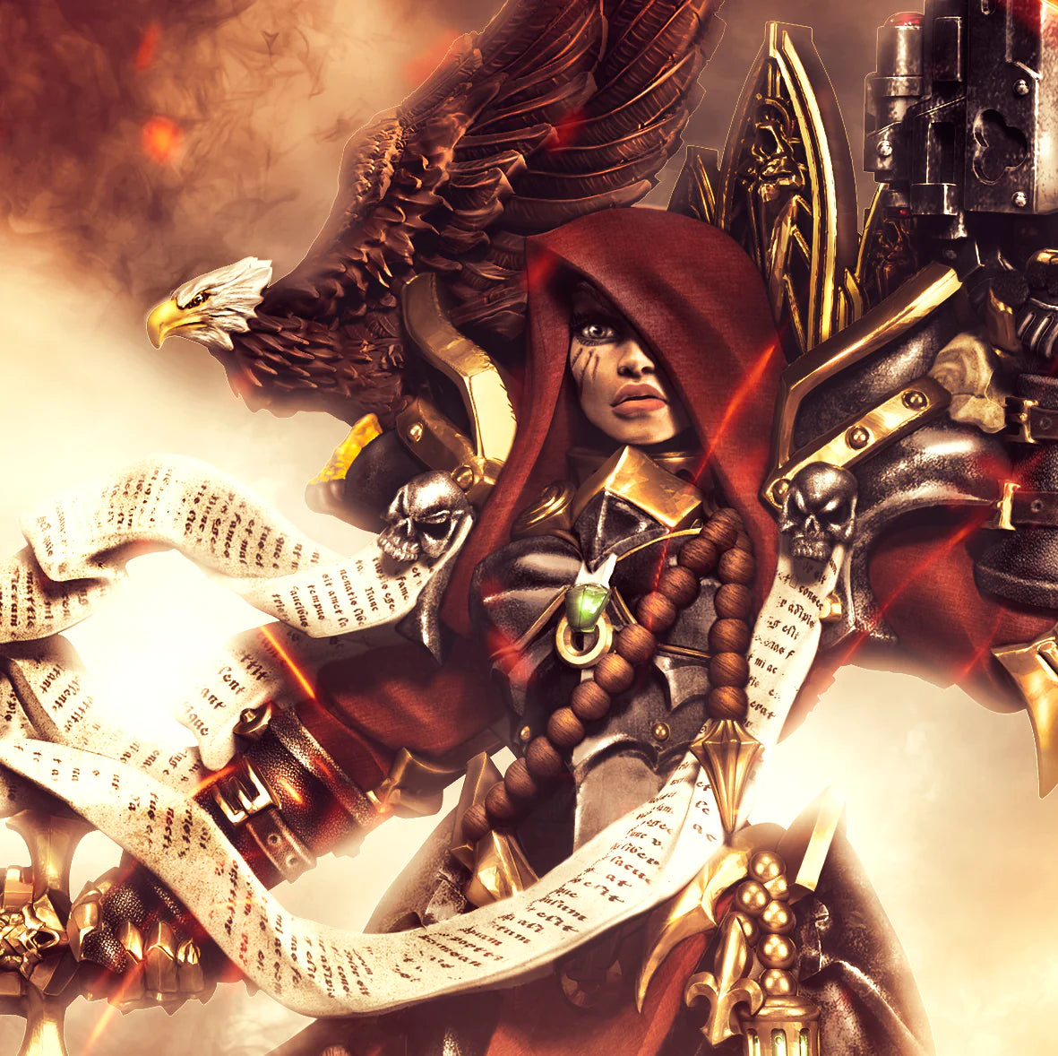
Constantly hailed as the best minis on the market, Raging Heroes miniatures are for the discerning wargamer who only want the most badass, beautiful and full of character miniatures

Fun lists to give you some inspiration on how to use our minis, or just to goof around...
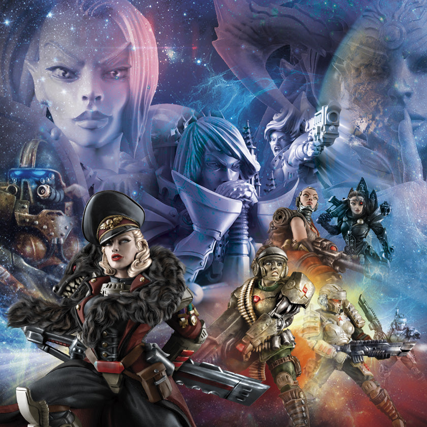
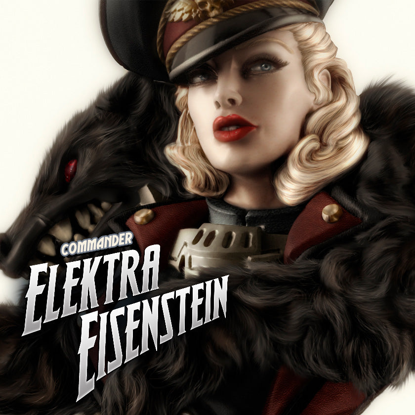
Let's start with 10 amazing women to lead your units and armies


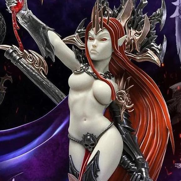
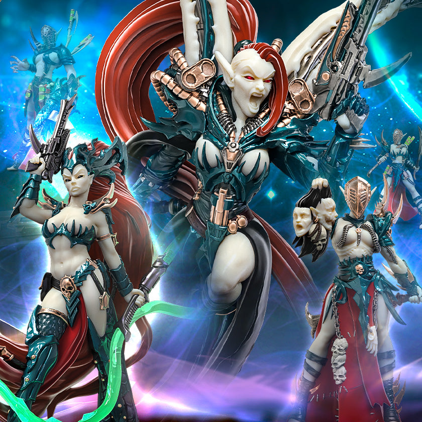
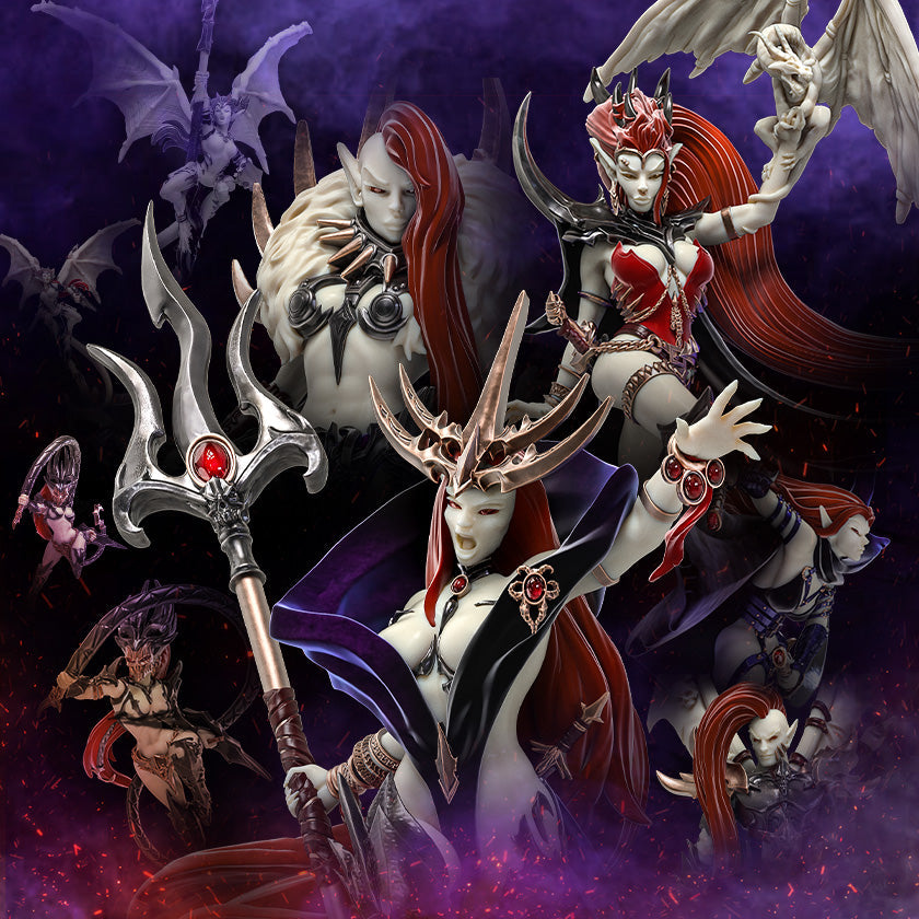
At Raging Heroes, every army we create starts with carefully chosen ingredients. For the Dark Elves, you've got: Refinement. Elegance. Extreme Evil. Gothic fashion. Japanese Rock bands. Scandinavian fairy tales illustrations from the 19th century. Find out more about your past and future favorites!


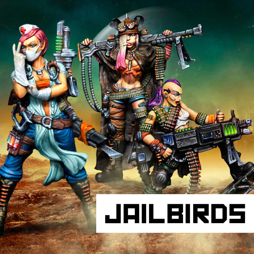
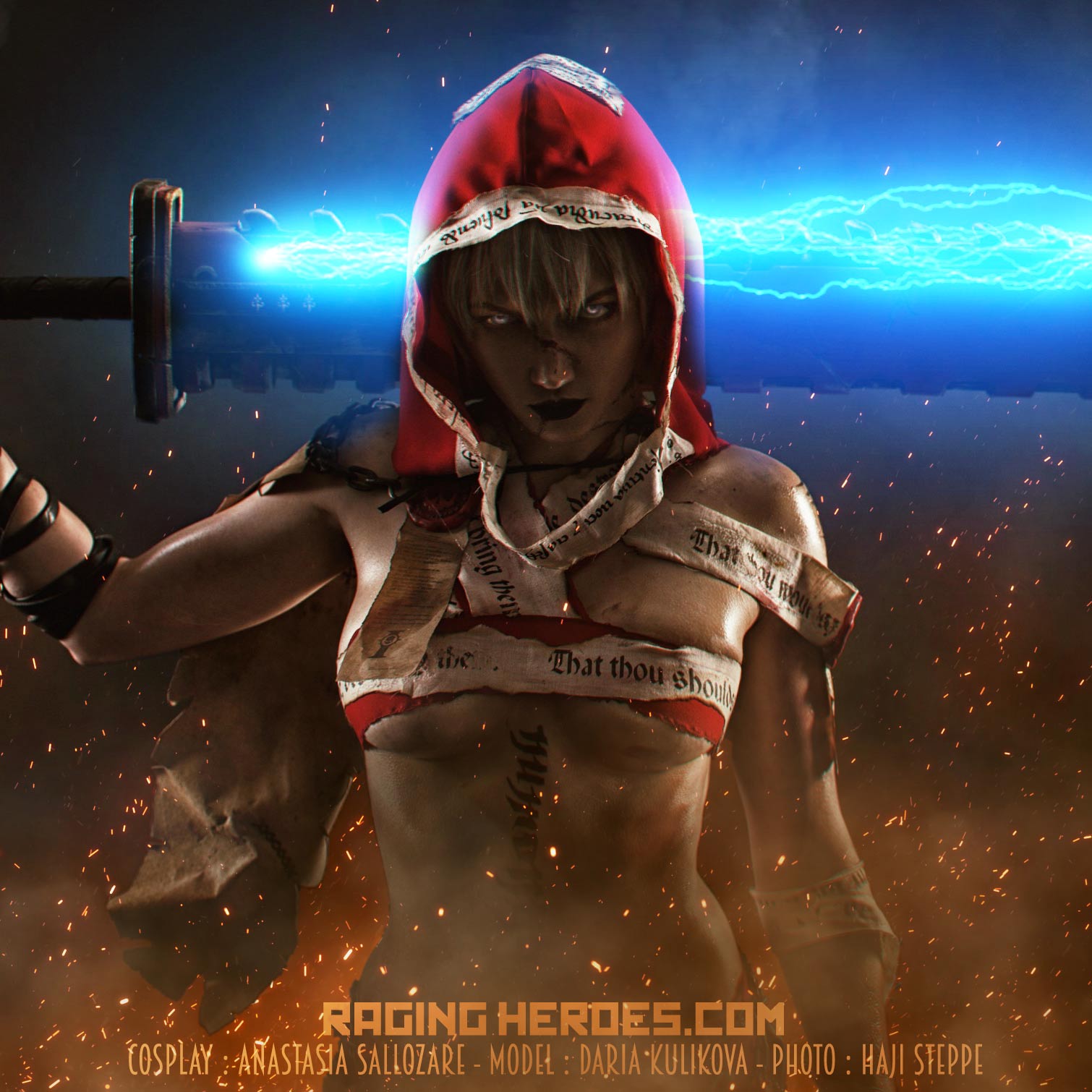
When we first envisioned the Jailbirds, we were crafting an army with the soul of a rock concert and the grit of a post-apocalyptic saga. It's for those who want to look at their miniatures and see a band of unique female badass characters!